Followers

Friday 29 March 2013

Basic Info about Distress Inks !!!

Hi Everyone,
Hussena here   to share with you all some more info about the uses of Distress inks ...As you all know our DT member Mallika has done a detailed post on it and shown you one of the fun technique using the distress inks so I am here to add a little bit more info about it ...I am starting by giving you a basic information about the Distress inks and here is what Ranger has to say about these inks :-

'' Tim Holtz Distress Inks are a collection of 48 acid-free, non-toxic, fade resistant, water-based dye inks. They're perfect for the new vintage, stained, aged effect crafters are creating in their altered books, scrapbook pages, cards and paper craft projects.

Tim selected the colors and helped develop these inks to produce a realistic, weathered look on paper, photos and decorative fibers. All the colorful Distress Inks afford added versatility when photo tinting and color layering with the original, award winning tones.
The 2" x 2" pads are made with a higher raised felt for easier use with direct to paper techniques, Re-inkers available in .5 oz. amber glass bottles with eye drop applicators....''

You can check out all the NEW colors as well as the old ones HERE

These are the original 36 shades of Distress inks :-


 And here are the New shade's that have been added besides the original 36 shades :-


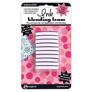
Now lets have a look at the tools that are mainly used with the Distress inks to help in blending & coloring your project :-
                                                 

And these are the blending tools by ranger one is a wood handled applicator and other is  blending foam which helps in evenly spreading the inks across your work surface.
Now I wanted to discuss the different uses of these inks and why they are a MUST -HAVE for any new crafter!...Some of the most common techniques using the Distress inks are :-
                                           
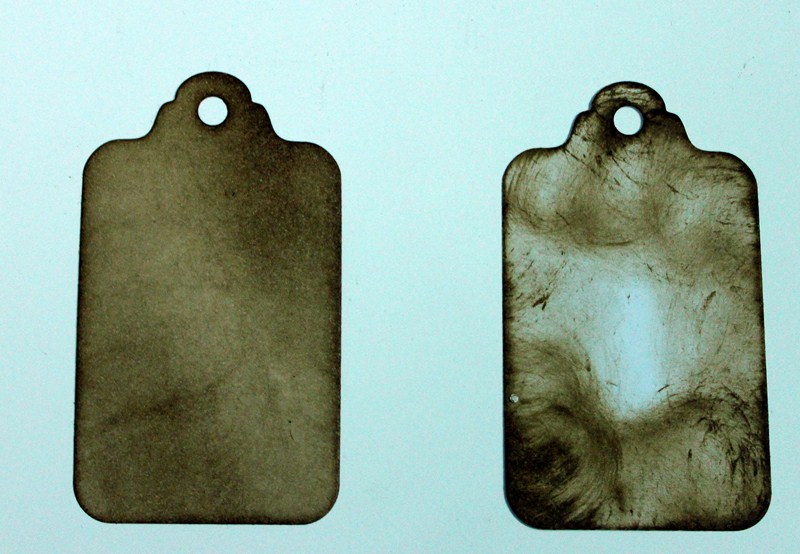
1. BLENDING & DISTRESSING - Our DT Member Shalini Pahwa has done a fabulous tutorial on this technique ...As you can see below :-


And also a look at what Mallika had shown you all about how to go about Blending & the colgate paste technique. :-


2.EMBOSS RESIST & COLORING USING DISTRESS INKS - Here I have used the Distress inks to create the background as well as to color the stamped flowers and leaves....


3.STAMPING - Our Dt Member Priya  has done an  amazing tutorial on Stamping with Distress inks...Check it out below :-


4. USING DISTRESS INKS TO COLOR & DISTRESS YOUR HAND-MADE FLOWERS - I love making my own flowers...And with Distress inks it gives such a realistic look and it really enhances the look of your hand-made flower just by simply distressing the edges with the inks or coloring your entire flower with the Distress inks like I have done in the Orange flower below :-


ETA: I am Sorry that I had not been able to add our Dt member Kavitha And Anita's work in my post earlier as I was really struggling with Internet issues and I was finding it very difficult to upload and save pictures...But here is a look at their work now using Distress Inks! :)..
5.CREATING BACKGROUNDS WITH DISTRESS INKS- Our Dt Member Kavitha has done two amazing posts showing this technique on how to use Distress inks to create beautiful backgrounds...!!


6.STAMPING AND HIGHLIGHTING USING DISTRESS INKS - Our Dt member Anita has done a fabulous video tutorial on how to use Distress Markers to color and use the Distress inks to highlight her cards!..


Besides these techniques that we have shown...There are many more techniques and uses of the Distress Inks....Which Jennifer McGuire has shown in this video HERE...Do check it out!

And now lets discuss about how to go about buying your first set of Distress inks :-

The information that I have gathered from various sources of the net and from a fellow blogger Tejal who is an expert and a perfectionist when it  comes to Stamping is that one should start buying the BASIC colors first that is : 

Shabby Shutters (Green)
Broken China (Blue)
Worn Lipstick (Pink)
Mustard Seed (Yellow)
Barn Door (Red)
Once you have these basic colors then you can expand your collection by buying One shade darker and one shade  lighter colors that the Ranger company provides...Like for example: For Blue : You can first buy Broken China then go for Tumbled Glass (Lighter  Blue) and then Faded jeans (Darker Blue) and Chipped Sapphire( Very Dark Blue)...And Salty Ocean being the new edition in the Distress Inks family!

And buying the Vintage Photo (Brown) ink is DEFINITELY A MUST!...Once you have this color ink you will find yourself using it in almost all your projects!...And this I am telling you from my OWN experience!

And now coming to the best part...Crafter's  Corner has the ENTIRE  RANGE of Distress Inks ...Both OLD and NEW...!!...And that also at a very reasonable price of Rs 270 for the old inks and Rs 350 for the new shades ..So hurry and place your order Now :)
www.crafterscorner.in ( All Craft supplies under one Roof )
For further queries mail us at info@crafterscorner.in
Have a Nice day Everyone :)

Tuesday 26 March 2013

Tag created using distressing, stamping and embossing techniques


 Hi Friends

I am here today with my creation for the month and a detailed tutorial on the same.

Continuing the theme for the month – Stamping and Distressing, I have used various techniques of both of these to create a Gift Tag.

I would be dividing my tutorial in 3 parts – (a) Background, (b) Stamping and (c) Embellishing

Background : First I took a plain card stock and used distress ink to create hues of color across the tag (used Tim Holtz Ranger Distress Ink-- squeezed lemonade, mustard seed, spiced marmalade, broken china, peeled paint) using distress tool for blending inks. The colored tag is then de-embossed to create a nice embossed effect.( Spellbinders-M-bossilities folder- Graden Delight ) using Big Shot Machine


Stamping : The Tag is then stamped with inkadinkado stamp using a contrasting and darker color ink. The stamp would thence also highlight the embossing while also giving a nice chic look to the Tag background.


Embellishing : For finalization of tag design, mulberry flowers are pasted around the main message board which is “Heartfelt Wishes” in this case. Some additional embellishment like a key, hang ribbon etc. can be used as per your design compatibility.

For more information on this creation and any query, please feel free to ask.

For complete range of distress ink, embossing folder and stamps, you may visit www.crafterscorner.in

And don't forget to participate at this month Challenge "Stamping" and the winner will receive an awesome stamping package.. Hero Arts Mid-tone Stone Wash Ink Pad and Lawn Fawn Be Mine Stamp Set.
So Grab this amazing pack !!!

Happy Crafting


Sunday 24 March 2013

Heat embossed cards..

Hello everyone!!!
 Its kavitha here to share some inspiration on this months theme-Stamping and distress inks.This is my last official post for crafters corner,my 6 months  DT  term is over and i am stepping down from my DT position .Hope you have enjoyed my inspirations so far.
So i have not one but two cards for you today.I am really hooked on heat embossing since we had embossing theme here in crafters corner blog. So here is my super inky cards..with lots of embossing and inking.

I love love the new distress colors-my most favorite is peacock feathers.For my first card i have heat embossed the background design and distressed it with more of peacock feather and a little of shaded lilac inks.The flower is also inked up with same shades as background and so is the butterfly.


I had some left over pieces of the embossed design after trimming it for my card,so i made a matching tag and bookmark.
For the book mark i have punched out some flowers out of the embossed paper.
Here is the other card with same color combo-peacock feathers and shaded lilac,i have also added some mowed lawn inks.For the edge of the card i just dabbed the versa mark ink pad directly and sprinkled some silver embossed powder and embossed it.For the veins of the flower i have used embossing pen and added some silver embossing powder.
Hope you liked both of my cards,the new colors in distress inks is so beautiful and vibrant..almost all the colors are must have.Check out crafters corner for the full range of new colors in affordable prices.
Supplies used:
VersaMark Watermark Stamp Pad
Hero art stamps
Tattered floral dies
Distress inks-Mowed Lawn, Shaded Lilac, Peacock Feathers 
Clear embossing powder 

If you have any doubt about the product or technique used,feel free to leave a comment.We are happy to help you.

  And if you have not linked up your creation for this time's challenge yet then please do so soon as there are some awesome prizes to be won!..Do check it out HERE


Thanks for looking.
Lots of love and happy crafting,
Kavi

www.crafterscorner.in (All craft supplies under one Roof)
For further queries do mail us at : info@crafterscorner.in


Friday 22 March 2013

Distress Inks and its Magic + Colgate paste wonders !


Hello Crafters ,

This is Mallika and its my turn to share something exciting with all the lovely crafters .

This time I have decided to talk about Distress Inks - The magical world of these 2.5  by 2.5 inch boxes .
Limitless possibilities and endless experimentation can be done via them .
As far as , in my two year experience of Distress Inks , knowing them via more than 50 videos on you tube I cant imagine a single project without their use .
I am trying my best  to summarize each and every aspect which I have learned from these .
You must have noticed , that almost every tutorial on Crafters corner has a part of distressing in it .
In short , Crafting begins with distressing . There might be a possibility where you think I am wrong with colors , in that case please please please free to correct me via comments below  , as we all know - in distressing - knowledge never ends .


What is Distress Inks ?
Distress inks are produced by Ranger Industries { USA } under the guidance of Tim Holtz . Probably when he made it , he even had no idea about the possibilities .
They are basically a pad soaked with ink in a box measuring 2 .5 by 2 . 5  inches approx .
Till now 36 + 12 colors have been released and crafters corner is proud to say that we hoard all .


What is Distressing ?
Distressing is basically giving simulated marks of age and wear to clothing , leather , furniture or paper . 
It is basically giving a weathered look . It is referred as refinishing technique although it is opposite of finishing in a traditional sense .  { Source - wiki for definition } 

Which all colors to buy first ? 
All of us , when we start our journey towards this beautiful world of crafts we always have this question what to buy first , where to invest first . Keeping this in mind when I bought my inks , I decided to go for one pad in every primary and secondary color + The king of all - VINTAGE PHOTO .
The most important color and I guess the most sold color is Vintage Photo . That should be the first buy of every crafter .


I hope you can see the color chart used in the picture above . '
To start with - I bought
1)Work lipistic for Red
2)Peeled Paint to cover Yellow and green
3)Broken China for blue
4)Spice Marmlade for orange
5)dusty concord for Purple
And ofcourse Vinatge photo .
This picture was used in my blog Dated March 17th ,2011  when I got mine .


Now the question - Why  I chose them ?
Basically the main idea behind taking these inks at first was to have one member from every color family . As a starter I could apply pressure to get variations in the shades .

How to store these Magic Boxes ? 
I basically stack them onto one another . I bought a self adhesive label from a local stationary shop and distressed them with the respective color , wrote the name and pasted  it as a strip on the four sides .
Result - I can see the name and color effect which I will get via them .
All the distress inks can be stacked onto one another and they take hardly any space .


What Basic tool I need to get the best effect ? 
The must buy along with these inks is a Blending tool .  For starting you can have just one tool , and a pack of foam for easy replacement and other colors . They get stuck in and out easily as a velcro patch is there on the tool .
The picture of ink blending tool and blending foam is below .

ALSO THE ITEMS MENTIONED ARE LINKED TO THE PAGE WHERE YOU CAN BUY THEM , SO SIMPLY CLICK THE ITEM AND YOU WILL BE REDIRECTED ON A SEPERATE WINDOW .


Now onto  the local jugad - Basically when I started I bought the local Makeup Foam to use these . Believe me , at that time I was happy with the result but now when I use the local ones - I can see the effect was bad.
These blending tool foams  are specially designed  to tag along with the distress ink pads . They basically blend the ink on the paper  - Blending is basically mixing symmetrically . What local foam does is that it gives you clear patches . See the picture below , you will clearly see the difference .


What I have done  is have one tool for every color and one foam for every color . 
Always keep some extra foams as they worn out with time . 
I store these in a wall panel which i got for all my tools . 


What Base to use while distressing ? 
In our busy life , we generally distress keeping the media onto the cutting mat . Remember - the effect is bad with the cutting mat or table . Ranger has introduced distress mats but you can replace them with simple ohp sheets or pvc bags .
Check the picture of distressing done with ohp base and cutting mat .


What more you should have along with these ? { not mandatory } 
Always keep the sprinkle bottles on your table along with tissue .
You should have a distress tear tool - Heart attack for example .
Reinkers of these inks - popular ones { I have vinatge photo }
Heat embossing materials , templates , stamps etc .


How are new distress inks ? 
The new twelve distress inks are beautiful , They have more rich look .
I had been using vintage photo alot , but somehow these days I love using gathered twig .
I recommend all the new colors , At present I hoard only 3 of the new ones .

Festive berries and Squeezed lemonade .


How to distress - proper method ? { SINGLE SHADE USE } 
Always keep a ohp sheet below . Start from out side the paper rolling and come inside . Give a flicking motion for light shade and more force for dark .
Always start with rubbing the edges first with foams and they do the rolling motion for ink distribution . After that blend more for proper coverage of space . The picture will demonstrate a better explanation .
Try to avoid full foam print , It can always be avoided by the sliding motion .
One super trick - Use the ink pad directly to make edge super defined .


How to use heart attack tool to give fabulous Tearing effect ? 
Take your distress tool , rub it with the edge . After sufficient tearing , distress it with your desired color to give a fabulous vintage and torned look - The weathered look .


How to make Beautiful Backgrounds ? { Multi Tone } 
Now in this via pictures and words I will try to make a beautiful background .
We will basically create a gradient .
I started with Faded jeans , I used the ink pad directly on the the edges to make them more defined . After that start blending from outside to inside in rolling motion .
Once all the sides are done with faded jeans , take your broken china and start your second layer .
After that take crushed olive and peeled paint and mixing those two give a gradient .
In the end blend entire Cardstock with faded jeans again .

\\


Mixed media with distress inks ? 
Now this might shock you , I will now teach you to create a background with the help of COLGATE PASTE !!!
Simply take a white / offwhite piece of paper .
Distress the edges by Walnut Stain , and inside by vintage photo .
After that simply take a paint brush and spread colgate paste unevenly on the surface . REMEMBER UNEVENLY .
Now take your heat gun and heat the the paste till becomes dry .
Once it is dry Distress is again with vintage photo or walnut stain  , this step will refine the uneven distribution.
Take your mist bottles , sprinkle the mist .
Let is dry or dry it via Heat emboss Tool .
Result - A beautiful Background . I created this box using the same   and a tag .
Pictures below to explain better .


Blending Ink Combinations - How to make them ? 
I am illustrating a set of pictures of the combination which I generally use .
There are many more which you can use , Just a rough idea of what I generally use .
Try to take same tones and create a gradient .


I have tried my best to illustrate each and everything which I know about inks above . Please rectify me if you want to add on more information .
For any queries on this .. write in comments below .
For any queries on the products write to info@crafterscorner.in

VISIT OUR WEBSITE - WWW.CRAFTERSCORNER.IN

All the products used are linked for easy reference .

Have a great day ,
Mallika